Wednesday, December 26, 2012

MOMA's Inventing Abstraction exhibit

Ending up in NYC by chance during the Holidays, I had a chance to view the groundbreaking Inventing Abstraction exhibit at MOMA in its first opening days. I have to say it was exactly what the doctor prescribed, a show the focus of which is the linking of a global strive towards abstraction. A huge map of connections, almost Linked-in like, greets you at the entrance, and you immediately realize that noone ever works in a vacuum, that all these separate geniuses whose work you admire for its originality, were in fact influenced by someone else perhaps even continents away. That famous phrase 'everything's been done before' no longer seems scary as it becomes clear that you can still find your voice in relationship to other voices.

Wassily Kandinsky

I also discovered during this show that abstract art has a formula, an easy one at first sight, but something that might take a while to adapt to in terms of your own preferences. The equation is made of three variables: color, paint application, and form. With my idol Kandinsky, forms obviously derive from a landscape, peaks and voids of mountains and gardens are visible, and a bold pure black line outlines them all. The canvas texture peaks thru as the color is applied in one expressive layer. To him, all the symbolism is in color: "I know what undreamed of possibilities color conceals within itself".

Robert and Sonia Delaunay research the sphere and place opposite colors side by side, shading their tonalities within a sphere.
Robert Delaunay
The futurists are all about hard lines, lots of cones, triangles and sharp edges. There's tremendous play of opposites and shading from light to dark. I especially loved Gino Severini, and the expressive strokes in his drawings.
Gino Severini
 
The Russian suprematists are difficult to grasp as it's just pure geometry and planes of color, but for them the very fine application of paint with tiny brushes across various planes seems key. Liubov Popova was a revisited discovery for me this time around.
Liobov Popova


Georgia O'Keefe all the way on the other side of the globe is so organic that it feels like she's painting plants or human forms and she's of course been criticized or applauded for that time and again, depending on the era. What she said I found truly powerful: "I found I could say things with color and shape that I couldn't say in any other way, things I had no words for." Her line is very musical, sensual and the palette is soft, pastel-like. A tiny brush and methodical application is, however, her method of paint application.
Georgia O'Keefe
 
And then of course, there're the Dutch and the famous Piet Mondrian with his grids of vertical and horizontal lines. Somehow, I didn't realize he was Dutch and that others right beside him were part of the De Stijl movement. Nevertheless, his piece below simply blew me away. Everything is perfectly balanced and your eye moves around to methodically placed limited colors. Unlike Kandinsky, he employs layers upon layers of paint in a soft, calming way, once again - balanced.
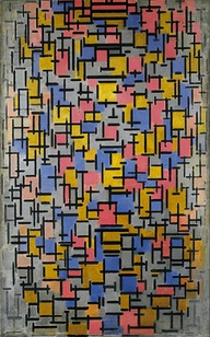
 Piet Mondrian
 
It's a grand show, and a must for anyone in love with abstraction. It's also perfectly presented for those simply curious about the development of art in the 20th century and not quite getting what abstract art is all about. All the greats are here, perhaps with the purposeful ommission of the usual suspects like Picasso, Matisse and Cezanne. Kudos to MOMA and to its curatorial staff!


Friday, December 14, 2012

Uwe Kowski - my favorite artist at Art Basel Miami Beach

 
Represented by Eigen Art of Berlin, Uwe Kowski's work was a true discovery for me at this year's edition of Art Basel. Great sense of color, depth, and and very interesting strokes.

Wednesday, December 12, 2012

Balance

If you pay attention to spreading one color in a balanced way around the canvas, you don't run the risk of getting stuck in the details - a true pitfall. You're also then a lot more cognizant of the type of stroke you're making - for me it's the short horizontal slab with a palette knife that brings the most satisfaction, especially when there's sufficient color that your edge can examine their relationships. Another element that adds to the sameness of texture is s the tool you use, that is staying with same palette knife or brush if repetition is desired, or switching it to a thin outline with a tiny yet bold brush line. I'm certainly a descendant of Russian painters (Kandinsky, Chagall, Rothko), string  the bold black outline is very important to me after all, especially when it's a jagged dancing stroke that seems to resemble a sting. The appearance of this pulsating string seems to be more importance than simply the color relationships. Pay close attention to the palette you're mixing on for pleasing color combinations - this might be the best guide for your painting's progress if nothing else. And know when you get tired in order to stop before it's too late.

Wednesday, November 21, 2012

Volume

I set out to reach a point between figuration and abstraction where just enough is being said, but not quite so much to ellicit concrete references. I substituted a brush for a more expressive palette knife. I added texture with the impasto technique. I stopped taking photographs of the landscapes I paint in order to limit my desire to perfect a scene. And yet, with the passing of time it appears that my pieces are only getting more dense and representational. It bothers me that then I want to achieve perfect perspective, or ouline something just enough to be able to feel its mass. These wishes are too literal. They shouldn't be relevant in an abstract work. How easy it must be to just choose a few lines and take off without prior knowledge of proper means of representation. It is just so difficult to convince yourself to stay general, to break the piece simply into planes, or fields of color. It takes tremendous leaps of faith to trust yourself in a completion of a color relationship, in the placement of a bold line. Perhaps this is where the mastery is - to depart from a mere representation to a complicated and impactful world within. Perhaps this search for a place to call home would end where no known references reside. Till then, the search continues...

Friday, November 9, 2012

Have you checked what you're listening to lately?

So it may seem obvious or it may not, but what's on my stereo is always influencing what gets out and on to canvas. I've grown up with hard rock music and oftentimes it triggers nostalgic memories and aids me in bringing me back to my roots and their expression. Other times, it's just too strong of an influence. The lyrics are meddling with my thought process, making me unable to focus and concentrate. A Latin motive may elicit more energy than I may have had on a given day, but it soon begins to almost dictate what type of line and color it wants. Classical or soft jazz rhythms are usually too calming for me. My art sensibilities require peaks and voids and strong voices or instruments. However, I am always in search of meditational music that focuses on repetitions of phrases that I cannot understand. Then, it's simply a voice that I react to and it's almost like a conversation in the background an the foreground. It's a prety incredible exercise to switch between various musical genres during an art studio visit. But, beware of what it may do to a painting. It may make it a bit too saturated and confusing.

Thursday, October 18, 2012

Moods

A body of work is starting to come together and though I sense similarities in a palette and obviously the theme of landscape, each one of these pieces is incredibly different in terms of its mood. It's truly remarkable how my current state of being is influencing the piece. These past few months have been stressful and panicky with a new baby. As a result, my latest painting, 'Lilac Day', is simply making me nervous. The lines are anxiously spreading in all kinds of directions, the contrasts in colors are highly overt. There's true tension here, especially in comparison to the previous piece, 'Mount Fuji'. Now could it be as simple as direction of a line and a balanced out composition? Or is this a result of a transfer to a much more expressive palette knife paint application and addition of wax medium to create texture? The only way to find out is to mix the two: use up the little remaining wax with a palette knife and then move back to painting with a brush. Would this result in a piece with an interesting mix of moods or would it simply become muddy and confusing? We shall see.

Monday, October 8, 2012

Direction

It's incredible how immediate our sense of direction is. If there's a horizontal line, it right away suggests a horizon; if there's a vertical line - it's a tree or a building reaching to the sky, any tilting in the stroke and it suggests wind and motion. It's impossible to create an abstract painting without these immediate visual references and more often than not it's when one sees these markers that the piece becomes somewhat confusing. Does this mean you stick with just vertical lines, or horizontals, or you're reaching for the left, or going to the right? Otherwise, it's an immediate reference to a landscape and you're nor here nor there...

FYI, I'm hosting a kids workshop this coming Saturday, October 13th, weather permitting, at the Waldstein Playground in Brookline. Would love to see your kids there. Let me know if you can make it so I could organize enough supplies!