Showing posts with label Kandinsky. Show all posts

Friday, December 16, 2016

My Favorite Artists on Instagram

As I explore Instagram as an outlet for my art, and as part of #taaigchallenge, I'm seeing some really great work, and I feel it's important to share it as means of inspiration.
I thought once in a while everyone needs some inspiration, so here are some of my favorites:

I love patches of harmonious color like #UweKowski
I love scraped off surfaces a la #Gerhard Richter
I love ghost trees in the style of #WolfKahn
I'd love my line to be as piercing as Hiroshige Fukuhara
I think the saturated scenes of Stevnn Hall are amazing
The color harmonies are simply perfect in Julia Powell's work:
and I'd love my symbols to be as spiritual as #Wassily Kandinsky, whose birthday is today incidentally...

But god damn it, I want it to be my language that combines all those and transforms into something new, blended seamlessly, yet making a contrasting statement. It'll stem from nature but be taken to an imaginary paradise: where borders are barely visible, where sky falls onto earth, and sand can rise to meet crashing waves. It's where trees can spread their curious branches far into the amplified skies, and they can separate the landscape into mini-icons where one's eyes rest while taking a break from the whole spectacle. It's now my color theory and not Quiller's or Kandinsky's. It'll be my melted, scratched, layered world where I can fit in all my hopes and aspirations, my struggles and disappointments.


Tuesday, March 15, 2016

Let your inner child play as long as she wants

Reflecting on a memory of a real landscape brings so many questions. Even after I figured out the mood for the painting, and limited my palette accordingly, I was still struggling with just how precise this depiction needs to be. As much as I wanted to leave the reality of the scene, things like perspective, shapes and textures of specific subjects were forcing me to stop and reconsider my every move.

When does this adherence to reality take a break, and lets the imagination take over? How can I open a door to creativity if a constant logical critic sits on my shoulder and demands accuracy and academic realism? How did Kandinsky accomplish this feat? To have a landscape and to not have it at the same time? To let shapes, colors and lines take over the composition? To have a real scene turn mythical, become a dreamscape?

I guess a lot of it is a dance of inner voices, but in a dance there's always a leading partner. How can the lead shift to a more abstract thinking section of the brain? Perhaps these voices relinquish control and don't take turns? When there's a real marriage of color and line - the trick is to not turn on the switch back to observation, and to just let yourself sink into the simple pleasures of mixing colors, the way a little child would, for hours.Yes, that is it. Just like I force myself (not always successfully) to not interfere and let my children play their game of choice for as long as they need, I need to not rush my inner child, and let her play as long as she wants. Then just stop before judgment kicks back in.

Then the goal is to repeat this for every painting session...and for every child's invented game.

Wednesday, September 25, 2013

Melting away...all masks

As much as I try, I can't get away from reality. I can't reach within and call forth images sitting deep in some innermost layer.

So my new answer to all this representation is melt the reality...melt it away like the Wicked Witch of the West, remove all those built up textures, all these layers of masks.

The process is really difficult on me as it requires so much patience. It's the antidote to my fierce piercings with a palette knife.

What it does is slowly bring out all these unexpected nuances in color relationships, plays of textures that are so different from what I typically employ. Drips fall like tiny tears, so difficult to extract, always from unpredictable little caves, opening newer hideaway places, shifting priorities. It's like reliving a dream, peeling its meaning bit by bit, the unwilling truths. Bubbles of bile all of a sudden explode into fireworks of new answers. If all masks could shed like this, leaving room for brutal honesty with self and with the world.
This is a work in progress...the tricky thing is knowing where to stop...The media is oil paint and wax, which is then melted down with a heat lamp.

Sunday, February 10, 2013

Doesn't everyone love ice cream?

That's the consistency of oil paint when it's mixed with wax and it almost feels like you can taste the different flavors: sweet red or tart green or chocolate brown. It just feels so malleable and soft when the hard edge of a palette knife brings it all together.

Now the palette knife - its main quality is scraping, having new color intrude on the old but not kill it, rather let it peak out in just the right proportions. That's why everyone is so into Gerhard Richter's work with scratched out surfaces. It marries the old and the new in unexpected combinations  - the flavors of ice cream never before attempted together.

You see the function of color best in Monet, Rothko, Pollock, Kandinsky. De Kooning I think was a total anti-colorist just as Picasso before him. Vuillard and Bonnard, Matisse - the fauves are seeing color in a completely separate light.

Wednesday, December 26, 2012

MOMA's Inventing Abstraction exhibit

Ending up in NYC by chance during the Holidays, I had a chance to view the groundbreaking Inventing Abstraction exhibit at MOMA in its first opening days. I have to say it was exactly what the doctor prescribed, a show the focus of which is the linking of a global strive towards abstraction. A huge map of connections, almost Linked-in like, greets you at the entrance, and you immediately realize that noone ever works in a vacuum, that all these separate geniuses whose work you admire for its originality, were in fact influenced by someone else perhaps even continents away. That famous phrase 'everything's been done before' no longer seems scary as it becomes clear that you can still find your voice in relationship to other voices.

Wassily Kandinsky

I also discovered during this show that abstract art has a formula, an easy one at first sight, but something that might take a while to adapt to in terms of your own preferences. The equation is made of three variables: color, paint application, and form. With my idol Kandinsky, forms obviously derive from a landscape, peaks and voids of mountains and gardens are visible, and a bold pure black line outlines them all. The canvas texture peaks thru as the color is applied in one expressive layer. To him, all the symbolism is in color: "I know what undreamed of possibilities color conceals within itself".

Robert and Sonia Delaunay research the sphere and place opposite colors side by side, shading their tonalities within a sphere.
Robert Delaunay
The futurists are all about hard lines, lots of cones, triangles and sharp edges. There's tremendous play of opposites and shading from light to dark. I especially loved Gino Severini, and the expressive strokes in his drawings.
Gino Severini
 
The Russian suprematists are difficult to grasp as it's just pure geometry and planes of color, but for them the very fine application of paint with tiny brushes across various planes seems key. Liubov Popova was a revisited discovery for me this time around.
Liobov Popova


Georgia O'Keefe all the way on the other side of the globe is so organic that it feels like she's painting plants or human forms and she's of course been criticized or applauded for that time and again, depending on the era. What she said I found truly powerful: "I found I could say things with color and shape that I couldn't say in any other way, things I had no words for." Her line is very musical, sensual and the palette is soft, pastel-like. A tiny brush and methodical application is, however, her method of paint application.
Georgia O'Keefe
 
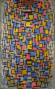
And then of course, there're the Dutch and the famous Piet Mondrian with his grids of vertical and horizontal lines. Somehow, I didn't realize he was Dutch and that others right beside him were part of the De Stijl movement. Nevertheless, his piece below simply blew me away. Everything is perfectly balanced and your eye moves around to methodically placed limited colors. Unlike Kandinsky, he employs layers upon layers of paint in a soft, calming way, once again - balanced.
 Piet Mondrian
 
It's a grand show, and a must for anyone in love with abstraction. It's also perfectly presented for those simply curious about the development of art in the 20th century and not quite getting what abstract art is all about. All the greats are here, perhaps with the purposeful ommission of the usual suspects like Picasso, Matisse and Cezanne. Kudos to MOMA and to its curatorial staff!


Friday, December 14, 2012

Uwe Kowski - my favorite artist at Art Basel Miami Beach

 
Represented by Eigen Art of Berlin, Uwe Kowski's work was a true discovery for me at this year's edition of Art Basel. Great sense of color, depth, and and very interesting strokes.

Wednesday, December 12, 2012

Balance

If you pay attention to spreading one color in a balanced way around the canvas, you don't run the risk of getting stuck in the details - a true pitfall. You're also then a lot more cognizant of the type of stroke you're making - for me it's the short horizontal slab with a palette knife that brings the most satisfaction, especially when there's sufficient color that your edge can examine their relationships. Another element that adds to the sameness of texture is s the tool you use, that is staying with same palette knife or brush if repetition is desired, or switching it to a thin outline with a tiny yet bold brush line. I'm certainly a descendant of Russian painters (Kandinsky, Chagall, Rothko), string  the bold black outline is very important to me after all, especially when it's a jagged dancing stroke that seems to resemble a sting. The appearance of this pulsating string seems to be more importance than simply the color relationships. Pay close attention to the palette you're mixing on for pleasing color combinations - this might be the best guide for your painting's progress if nothing else. And know when you get tired in order to stop before it's too late.