Showing posts with label color fields. Show all posts

Thursday, November 16, 2017

Murakami vs Rothko at the MFA in Boston - is art meant to make you smile or cry?

There're a few new shows at the MFA currently that are quite interesting to me in their contrast to each other. It's the very much talked about Takashi Murakami exhibit vs. the Mark Rothko exhibit, which virtually noone knows about.
I find Murakami to be so flat, impersonal and superficial. Yes, he found a symbol that is now our association with him, that of the flowers with a somewhat sickening grin. When you see it, or especially them in bunches you immediately recognize that they're his. But what does it do to you as a viewer except for this pleasure of recognition? It invokes nothing. It's just a pure Pop statement that just like Warhol before him, or Lichtenstein or Jess Koons - has no emotional connection to anything in anyone's psyche.
And then I step into the world of Mark Rothko and I begin to weep while on my second painting. I can't really explain what makes me weep. It could be the layers of his emotionally charged juxtapositions of color. It could be the simplicity or the perceived simplicity of his vast rectangles chosen for all his compositions. But I can feel his fingertips spreading the paint, touching it, making it visceral, psychological, incredibly emotional. I can feel him getting to the core of the message, to the core of my soul. I see this incredibly powerful effect of layers on my psyche as a viewer.
If one encloses simple relationships that are of utmost importance in a casing that does not distract from the message, that's when it starts to say what it's meant to say. Therefore, in a way these two exhibits are about the same elements. There's a symbol or idea that is key, and through its repetition, within the same casings you see it manifesting as a style.
This casing or composition should not distract from the main idea and that's where I think my problem lies. My landscapes are always seen as of utmost importance, and the play of colors as secondary. When in reality what I want is for the landscape to translate as a shadow of itself, and for the real quest of color harmonies to manifest as a primary goal.
But my main issue with the perception of these two exhibits still remains. Are we as people of today more attracted to the superficiality of Murakami than the depth of feeling of Rothko? Or do auction prices for the sales of Rothko pieces say otherwise? Or were there always two camps of viewers - those who want to look at art and smile, and those who are searching for something that would make them cry?

Tuesday, December 20, 2016

Let your wild side play!

There's a part of me that's buried deep inside, a non-conformist wild side, a misbehaving child who I'm afraid to let out because god knows what demons she's going to unleash this time. It's a sexual, innocent, wondering creature who wants to dance, to explore, to enjoy her own company. The only time this wild spirit gets let out is while I'm painting. It doesn't matter what I'm painting. What matters is that it's a huge weight off my shoulders to let this hidden shameful part of me off the leash.

This is why when more and more life responsibilities are weighing on me, I find this time in the studio more and more needed. I retreat more and more into my shell.

Even in the process of painting my holding onto recognizable imagery and symbols is a sign of something holding me back. When it's just colors reaching deep into my soul, and textures playing like notes on my subconscious, that's when I truly love the process. Yet, at the end, the more reasonable, calculative, bashful side of me takes over and envelops it all in form, something like a fence to hold in all the raw emotions. When, oh when will they finally become unfenced?

Two of my students accidentally came into my studio and helped me melt wax. The sheer joy in their faces was unbelievable! How I'd love to simply be fulfilled with that joy.

Friday, May 6, 2016

Do you ever want to turn into a tree?

What's the significance of a girl turning into a tree? Is it a good thing or a bad thing? Why is it that every time she looks more human in this painting I get annoyed and every time she turns too unrecognizable I get equally frustrated?

If I am that girl - what am I gaining by this transformation? Is it oneness with nature, complete solitude from humankind, true expression? Why is it so scary? Is it because I'm losing myself: my softness, my uniqueness? I'm losing my limbs, my curviness, the features that make me - me. I have body sensations as a hand turns into a branch; it wants to unstick itself from this hardened mess. It feels as if I'm losing a battle to crazy glue... But then I'm gaining perpetuity, aren't I? No. Trees are as prone to dying, getting sick, suffering from cold and heat as we are, if not more.

So I'm sitting here marking pluses and minuses and figuring out which outweighs the other. But the main issue is that I'm still drawn to this idea, in love with this idea of a human turning into a tree. I even made a larger than life painting of Daphne in college that was stolen from the studio. What is there that keeps my attention? Perhaps this struggle I'm going through is actually my living through this transformation? In order to gain immortality of sorts you become hard-skinned, you lose bits of your genuine self. You don't know where to strike the balance.

I'd like to watch my kids quietly, yet be ready to step in at a moment's notice, not be paralyzed like a tree. This paralysis is really a paralysis of thought. I get stuck in this idea of fame, recognition, money making that I lose my genuine, original self. My limbs go one by one. Hands are so stuck in tree puss that they can no longer perform.

No, I want to be Daphne who hides in a shape of a tree, but not forever. She uses it as a temporary asylum but she's able to quietly come out of that masked existence and return to humanity. She should be able to do that. Trees are people that lost their way...

Wednesday, February 10, 2016

How important are your acquaintenance relationships?

As I embarked on the color theory journey along with my students, I feel that I'm getting lessons in subtlety. When you limit yourself to the very basic means, you only then start seeing nuances in relationships, in shades - those fifty shades of any color, in vibrancy, in temperature, and in transparency.

Everything doesn't need to be harsh, full of contrast, jarring in order to make an impact. Most of the time, the beauty lies in the subtle mixes of colors, and even more so in their transparent layers. An opaque layer covers all your tracks, all your moods of yesterday. While semi-opaque or translucent layers are able to neutralize if too much has been said, or add a little accent of focus.

All my life I've been searching for only the deepest relationships. It's all or nothing. You're not making it onto my friend list if we can't have the most intimate conversations. Mere acquaintances would stay by the wayside, as that's just what they were. I dismissed so many wonderful people because of this all or nothing approach. In reality, however, one can gain so much from even the smallest encounter with a stranger, or a mentor/student relationship, developing both ways. So much can be learnt from an inconsequential family visit, or a cocktail party conversation. Everything happens for a reason, and if you're only after the most idealistic statements, you miss the nuances, the everyday messages of life. I love this new bare essentials approach.

Wednesday, November 4, 2015

How do you set your priorities?

This painting has been haunting me in its purpose because it's a sudden internal shift from trees and all their symbolism to a cityscape. Did I need to do that for more people to understand me, or was it something inside of me that wanted a new or rather re-visited challenge? The answer to this question I don't know even now after the painting is finished.

What I do know is that it was a true lesson in setting priorities. What is more important to me - the infinite sky, the haunting water, or this magical town highlighted by rays of sunshine? It was a constant adjustment of what hides and what comes out. Especially fascinating was how the darkening of one element brought out another. 

One day my friend and teacher, Andrey Tamarchenko, came to visit, and said that textures can be varied throughout - treatment of water and sky should be softer than the rough outlines of a city with its decaying walls. I ended up making the sky and water more pale, and suddenly the city became clearer, as if coming out of a mist. But it bothered me because the city wasn't my focal point. It was actually the opposite - what I loved was the cityscape's complete integration into the landscape, how it effortlessly coexisted with the cloudy sky and the murky water. I changed it yet again to level out the planes, and that made me happy. So is the lesson to take away from this process the opposite of what I'd initially thought, and in fact you can really have it all? Or that perhaps you always need to make a list of priorities?

Thursday, January 23, 2014

The relationships between

The more I delve into abstraction, the more I realize that objects themselves matter so much less than their relationships with other elements adjacent to them. What's truly beautiful is an object that is able to extend beyond itself, to influence others with its luminosity, to reflect and uncover their hidden beauty.

When you are around someone for a long time and you truly make an effort to relish the relationship - you melt into that someone. Yes, you compromise something of yours, but that makes you that much richer.

And then, just like you never know how exactly paint will behave in a given moment, you don't ever know when a relationship will take another turn. You might attempt to comprehend someone for years, and after all this trial and error realize you don't complement each other. With people this shifting of gears only causes tremendous stress and fear, and most times a certain end, good in the grand scheme of a life that constantly moves...but terrible in the day to day emotional well-being. It'd be so wonderful to approach these turns philosophically, even enjoy them like I do with paint's uncertainty, its wonderful element of surprise. You never know what new wonderful encounters will materialize tomorrow.

Wednesday, September 25, 2013

Melting away...all masks

As much as I try, I can't get away from reality. I can't reach within and call forth images sitting deep in some innermost layer.

So my new answer to all this representation is melt the reality...melt it away like the Wicked Witch of the West, remove all those built up textures, all these layers of masks.

The process is really difficult on me as it requires so much patience. It's the antidote to my fierce piercings with a palette knife.

What it does is slowly bring out all these unexpected nuances in color relationships, plays of textures that are so different from what I typically employ. Drips fall like tiny tears, so difficult to extract, always from unpredictable little caves, opening newer hideaway places, shifting priorities. It's like reliving a dream, peeling its meaning bit by bit, the unwilling truths. Bubbles of bile all of a sudden explode into fireworks of new answers. If all masks could shed like this, leaving room for brutal honesty with self and with the world.
This is a work in progress...the tricky thing is knowing where to stop...The media is oil paint and wax, which is then melted down with a heat lamp.

Friday, June 7, 2013

Simple matter of palette observation


My work is always about color but it seems I always arrive at it accidentally. Somehow one hue ends up next to another and forms a perfect relationship. I'm not able to mindfully replicate it. It just sort of happens every time. However, all these trials end up on a palette and it can be part of practice to simply remember what works well with what, based on my own preferences of course, as it's all subjective.
We discussed with my mentor how this attempt to arrive at a formula that ws orks for the art world doesn't quite work. One's palette is truly a phenomenon of the left side of the brain, and simply pours out subconsciously. I still think it's doable, however, without it turning into automation.
Just say to yourself, pale green and subtle pink is a pair, and so is violet and lemon yellow, cadmium red looks stunning next to sage green...Or am I just now naming opposites on a color wheel, impressionist style?
Well, I tried to take these relationships to heart with this latest piece, and I think it sort of works, no?
I was also thinking that I always hated the color green, as it's so blah, and difficult to capture in all its various hues. But when I look at my work, it seems the parts I enjoy the most are the subtle relationships of various greens. So the idea for the summer is to limit myself and simply create a green painting...

Friday, March 1, 2013

Judgement and Inspiration

Why is it so easy to look at a dirty palette and judge it beautiful? Or someone else's finished piece and immediately know where it's lacking color for perfect balance? And yet it's ridiculously difficult to objectively judge your own work? Every time you step back and attempt to see what's missing - it's like you're dumbfounded, blind to your own mistakes. Sometimes, at a very magical time, the work leads you places and that's one happy moment of ecstasy - but to catch that wave - it's so difficult. The inspiration fairy doesn't visit every time you're at work - it's a fickle creature. Its presence it what makes or breaks the work though - you know that if you'd succeeded at following it - you're golden, and if it never materializes, the painting is doomed.

Here's one of the latest favorites where the inspiration fairy had visited, a few times...

Sunday, February 10, 2013

Doesn't everyone love ice cream?

That's the consistency of oil paint when it's mixed with wax and it almost feels like you can taste the different flavors: sweet red or tart green or chocolate brown. It just feels so malleable and soft when the hard edge of a palette knife brings it all together.

Now the palette knife - its main quality is scraping, having new color intrude on the old but not kill it, rather let it peak out in just the right proportions. That's why everyone is so into Gerhard Richter's work with scratched out surfaces. It marries the old and the new in unexpected combinations  - the flavors of ice cream never before attempted together.

You see the function of color best in Monet, Rothko, Pollock, Kandinsky. De Kooning I think was a total anti-colorist just as Picasso before him. Vuillard and Bonnard, Matisse - the fauves are seeing color in a completely separate light.

Wednesday, December 26, 2012

MOMA's Inventing Abstraction exhibit

Ending up in NYC by chance during the Holidays, I had a chance to view the groundbreaking Inventing Abstraction exhibit at MOMA in its first opening days. I have to say it was exactly what the doctor prescribed, a show the focus of which is the linking of a global strive towards abstraction. A huge map of connections, almost Linked-in like, greets you at the entrance, and you immediately realize that noone ever works in a vacuum, that all these separate geniuses whose work you admire for its originality, were in fact influenced by someone else perhaps even continents away. That famous phrase 'everything's been done before' no longer seems scary as it becomes clear that you can still find your voice in relationship to other voices.

Wassily Kandinsky

I also discovered during this show that abstract art has a formula, an easy one at first sight, but something that might take a while to adapt to in terms of your own preferences. The equation is made of three variables: color, paint application, and form. With my idol Kandinsky, forms obviously derive from a landscape, peaks and voids of mountains and gardens are visible, and a bold pure black line outlines them all. The canvas texture peaks thru as the color is applied in one expressive layer. To him, all the symbolism is in color: "I know what undreamed of possibilities color conceals within itself".

Robert and Sonia Delaunay research the sphere and place opposite colors side by side, shading their tonalities within a sphere.
Robert Delaunay
The futurists are all about hard lines, lots of cones, triangles and sharp edges. There's tremendous play of opposites and shading from light to dark. I especially loved Gino Severini, and the expressive strokes in his drawings.
Gino Severini
 
The Russian suprematists are difficult to grasp as it's just pure geometry and planes of color, but for them the very fine application of paint with tiny brushes across various planes seems key. Liubov Popova was a revisited discovery for me this time around.
Liobov Popova


Georgia O'Keefe all the way on the other side of the globe is so organic that it feels like she's painting plants or human forms and she's of course been criticized or applauded for that time and again, depending on the era. What she said I found truly powerful: "I found I could say things with color and shape that I couldn't say in any other way, things I had no words for." Her line is very musical, sensual and the palette is soft, pastel-like. A tiny brush and methodical application is, however, her method of paint application.
Georgia O'Keefe
 
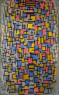
And then of course, there're the Dutch and the famous Piet Mondrian with his grids of vertical and horizontal lines. Somehow, I didn't realize he was Dutch and that others right beside him were part of the De Stijl movement. Nevertheless, his piece below simply blew me away. Everything is perfectly balanced and your eye moves around to methodically placed limited colors. Unlike Kandinsky, he employs layers upon layers of paint in a soft, calming way, once again - balanced.
 Piet Mondrian
 
It's a grand show, and a must for anyone in love with abstraction. It's also perfectly presented for those simply curious about the development of art in the 20th century and not quite getting what abstract art is all about. All the greats are here, perhaps with the purposeful ommission of the usual suspects like Picasso, Matisse and Cezanne. Kudos to MOMA and to its curatorial staff!


Friday, December 14, 2012

Uwe Kowski - my favorite artist at Art Basel Miami Beach

 
Represented by Eigen Art of Berlin, Uwe Kowski's work was a true discovery for me at this year's edition of Art Basel. Great sense of color, depth, and and very interesting strokes.

Wednesday, December 12, 2012

Balance

If you pay attention to spreading one color in a balanced way around the canvas, you don't run the risk of getting stuck in the details - a true pitfall. You're also then a lot more cognizant of the type of stroke you're making - for me it's the short horizontal slab with a palette knife that brings the most satisfaction, especially when there's sufficient color that your edge can examine their relationships. Another element that adds to the sameness of texture is s the tool you use, that is staying with same palette knife or brush if repetition is desired, or switching it to a thin outline with a tiny yet bold brush line. I'm certainly a descendant of Russian painters (Kandinsky, Chagall, Rothko), string  the bold black outline is very important to me after all, especially when it's a jagged dancing stroke that seems to resemble a sting. The appearance of this pulsating string seems to be more importance than simply the color relationships. Pay close attention to the palette you're mixing on for pleasing color combinations - this might be the best guide for your painting's progress if nothing else. And know when you get tired in order to stop before it's too late.

Wednesday, November 21, 2012

Volume

I set out to reach a point between figuration and abstraction where just enough is being said, but not quite so much to ellicit concrete references. I substituted a brush for a more expressive palette knife. I added texture with the impasto technique. I stopped taking photographs of the landscapes I paint in order to limit my desire to perfect a scene. And yet, with the passing of time it appears that my pieces are only getting more dense and representational. It bothers me that then I want to achieve perfect perspective, or ouline something just enough to be able to feel its mass. These wishes are too literal. They shouldn't be relevant in an abstract work. How easy it must be to just choose a few lines and take off without prior knowledge of proper means of representation. It is just so difficult to convince yourself to stay general, to break the piece simply into planes, or fields of color. It takes tremendous leaps of faith to trust yourself in a completion of a color relationship, in the placement of a bold line. Perhaps this is where the mastery is - to depart from a mere representation to a complicated and impactful world within. Perhaps this search for a place to call home would end where no known references reside. Till then, the search continues...

Sunday, August 12, 2012

Color intensity & setting limits

When given a full range of color you inevitably want to use whatever is available and yet that's what creates unsettlement, confusion and lack of focus in a work. Masterworks show, even Monet's more abstract late landscapes, that the most powerful relationships are of key two or three colors. The rest are minor accents. However, it's the limitation and the choice of those most powerful relationships that poses the most difficult question in a painting. Somehow, just utilizing two or three colors isn't enough. The accents are just as important, even though there're less of them. So really it's this play of intensity that is key. It's the constant control over composition, quantity and power of pigment that is at play.

Saturday, July 14, 2012

Color relationships

The other day a good friend and collector was telling me about a show he saw at MOMA in New York by an artist who worked on 20 landscapes at a time with one color. He seemed baffled by the complexity of the idea of placing a color so boldly without the rest of the painting figured out. To me, it seems like a completely opposite phenomenon and an excellent exercize. Our whole world of perception is about our reading of color relationships. It makes it that much easier to start from an abstract color field and play with how another color will effect its impact. Yes, the idea might be daunting if one doesn't feel his/her palette. However, an artist overtime comes to undesrtand his inner color wheel and should be able to apply it in either an abstract or representational format.