Ending up in NYC by chance during the Holidays, I had a chance to view the groundbreaking
Inventing Abstraction exhibit at
MOMA in its first opening days. I have to say it was exactly what the doctor prescribed, a show the focus of which is the linking of a global strive towards abstraction. A huge map of connections, almost Linked-in like, greets you at the entrance, and you immediately realize that noone ever works in a vacuum, that all these separate geniuses whose work you admire for its originality, were in fact influenced by someone else perhaps even continents away. That famous phrase 'everything's been done before' no longer seems scary as it becomes clear that you can still find your voice in relationship to other voices.
 |
| Wassily Kandinsky |
I also discovered during this show that abstract art has a formula, an easy one at first sight, but something that might take a while to adapt to in terms of your own preferences. The equation is made of three variables: color, paint application, and form. With my idol
Kandinsky, forms obviously derive from a landscape, peaks and voids of mountains and gardens are visible, and a bold pure black line outlines them all. The canvas texture peaks thru as the color is applied in one expressive layer. To him, all the symbolism is in color: "I know what undreamed of possibilities color conceals within itself".
Robert and Sonia Delaunay research the sphere and place opposite colors side by side, shading their tonalities within a sphere.
 |
| Robert Delaunay |
The futurists are all about hard lines, lots of cones, triangles and sharp edges. There's tremendous play of opposites and shading from light to dark. I especially loved
Gino Severini, and the expressive strokes in his drawings.
 |
| Gino Severini |
The Russian suprematists are difficult to grasp as it's just pure geometry and planes of color, but for them the very fine application of paint with tiny brushes across various planes seems key.
Liubov Popova was a revisited discovery for me this time around.
Liobov Popova

Georgia O'Keefe all the way on the other side of the globe is so organic that it feels like she's painting plants or human forms and she's of course been criticized or applauded for that time and again, depending on the era. What she said I found truly powerful: "I found I could say things with color and shape that I couldn't say in any other way, things I had no words for." Her line is very musical, sensual and the palette is soft, pastel-like. A tiny brush and methodical application is, however, her method of paint application.
Georgia O'Keefe

And then of course, there're the Dutch and the famous
Piet Mondrian with his grids of vertical and horizontal lines. Somehow, I didn't realize he was Dutch and that others right beside him were part of the De Stijl movement. Nevertheless, his piece below simply blew me away. Everything is perfectly balanced and your eye moves around to methodically placed limited colors. Unlike Kandinsky, he employs layers upon layers of paint in a soft, calming way, once again - balanced.
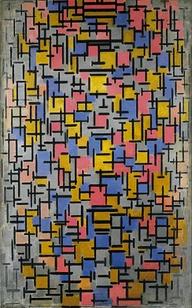
Piet Mondrian
It's a grand show, and a must for anyone in love with abstraction. It's also perfectly presented for those simply curious about the development of art in the 20th century and not quite getting what abstract art is all about. All the greats are here, perhaps with the purposeful ommission of the usual suspects like Picasso, Matisse and Cezanne. Kudos to MOMA and to its curatorial staff!


 And though I thought that having been in this world would help me in entering it as an artist, it seems that my mind cannot function simultaneously in various roles. I can look at art as a dealer, judging what might sell well and for how much. I can look at art as an art critic for its successful formal aspects. However, I cannot apply the same principles to my own art. I cannot tell myself to do this or that in accordance with current trends in the market. My voice just sort of comes from within and that's the end of the story. However, here're some of my personal favorites from the show and why I liked them.


 Love how the figure dissapears into nothingness, love the play of texture and flatness, love the contrasts and limited palette.